
This mural, “From Lorain, with love,” is the most public and permanent installation of my art, to date. It was my first time painting on a wall that wasn’t my own wall, and first time that a piece of my art can’t be taken down or moved around.

Needless to say, I got a lot of other little projects done in the wake of trying to get into this mural! (Oh hey procrastination…)
I thought I’d tell you a little about my process, besides the procrastination, and some things I learned along the way.
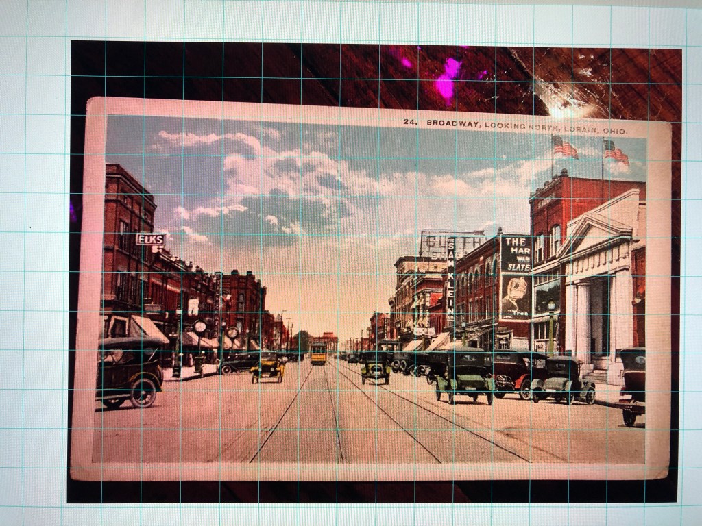
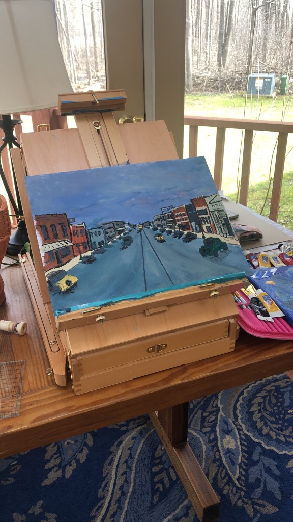
I started the process by putting a grid over a photo of the original postcard and making a 12”x16” painting of the scene.
One thing that was going to be different from past paintings was that I’d be doing this from a limited pallet. This is a good and common practice in painting. Mixing your colors from one set of colors guarantees that your colors will be in the same family. Wall paint is not cheap, nor does it come in small amounts. So! Head first into mixing colors we go! It ended up fine, but definitely was a learning curve.
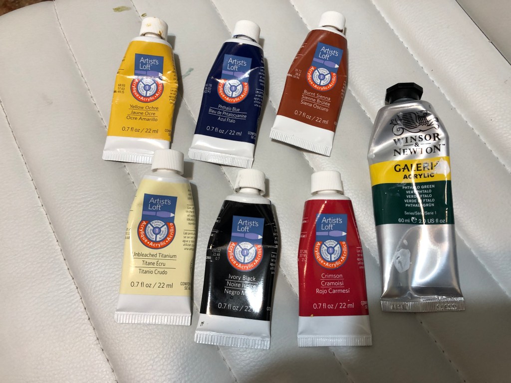
Generally, you begin with a yellow, a red, a blue, white, and maybe a green. Often those colors, specifically, are basic yellow, basic red, ultramarine, generic white, and Phthalo green. Above, are the colors used in my practice painting: Yellow ochre, un-bleached titanium, crimson, ivory black, Phthalo green, burnt sienna, and Phthalo blue.
Going to Sherwin Williams with those tubes and name colors did not go well. For unknown reasons, they cannot look up colors via any code other than their name for a color, or another company’s name for a color. This was infuriating to say the least. (They actually asked me if I knew the name for it in Benjamin Moore paint… but RGB? CMYK? Hex? Pantone color? Nope.). To add to the insanity, on their website, they display each of their colors with its corresponding hex value, so I’m not sure where the disconnect happened.
Anyway, I ended up with a yellow ochre, a crimson (wayyy more muted than intended), burnt sienna (they actually had that one), and a gallon of matte white.
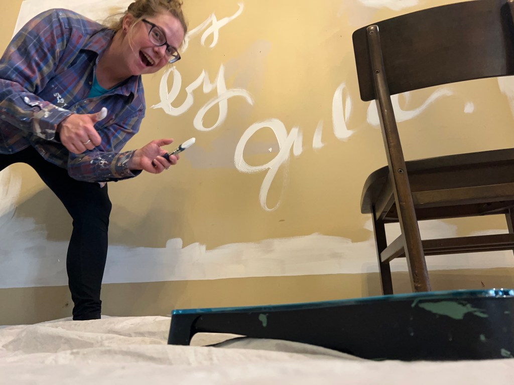

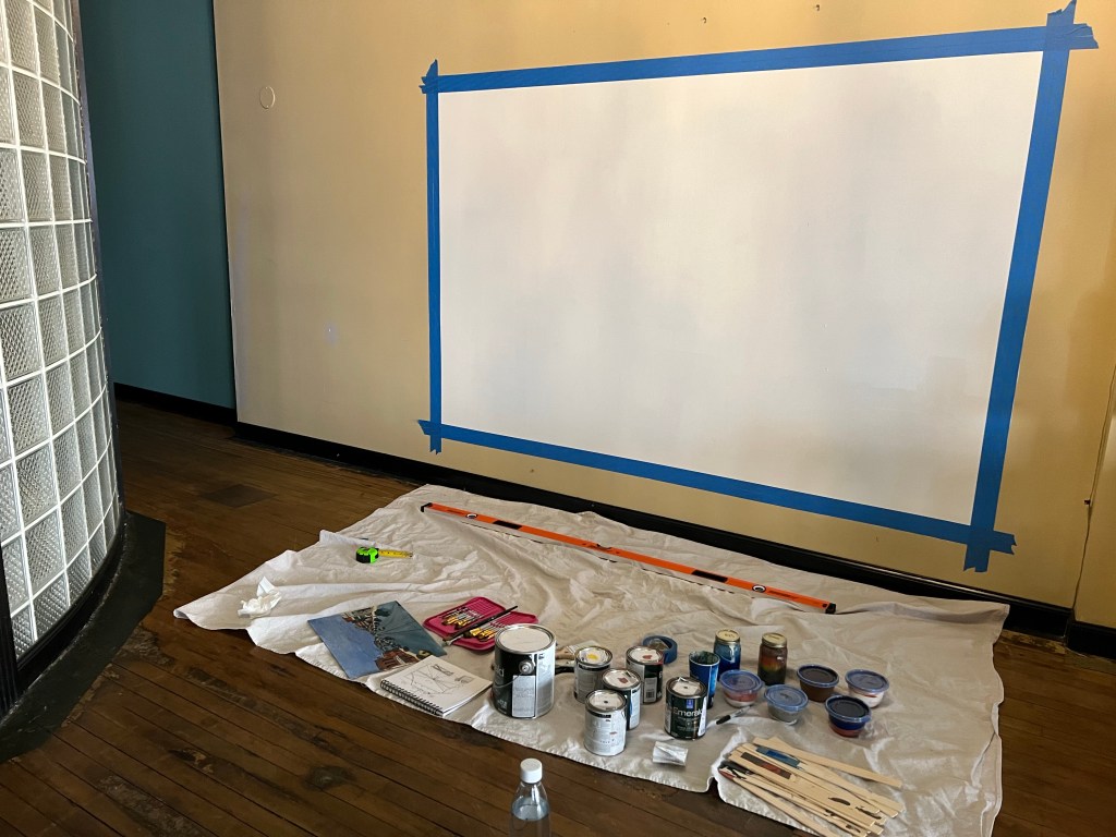
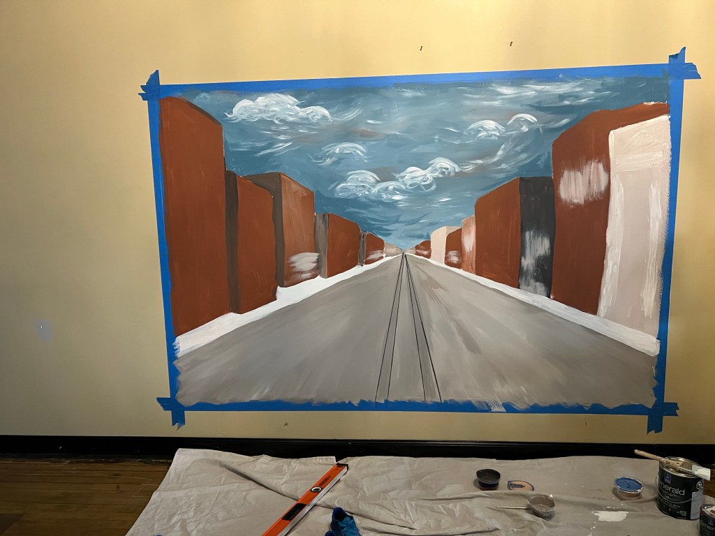
Day One: I headed over to Union Town Provisions to paint the white background first so that it could dry over the weekend. Free handing a perfect rectangle – not trivial! I used a huge 5-foot level we had for installing a door at home, a pencil, and painters tape. It took me around 2 hours to make the 9 foot by 6 foot rectangle perfect. One thing I learned was that wall paint is not the same as acrylic artist’s paint. It drips way quicker than others. So my style of putting on lots of paint and allowing there to be depth to the painting resulted in drippage that was distressing, but I was able to recover from it.
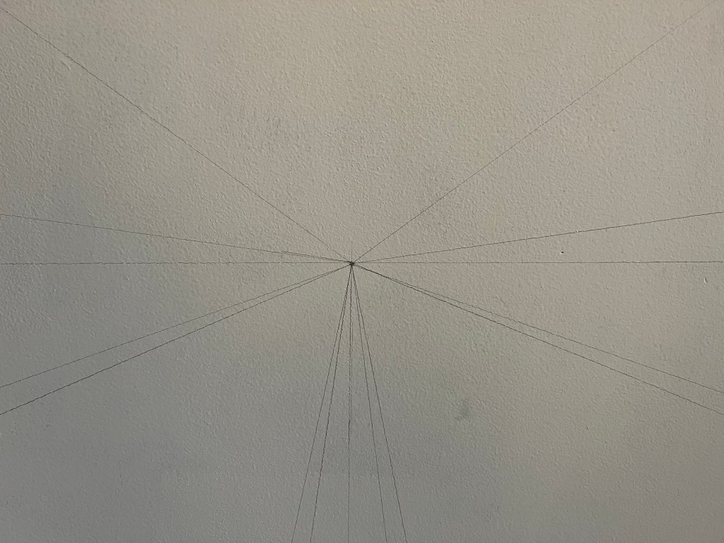
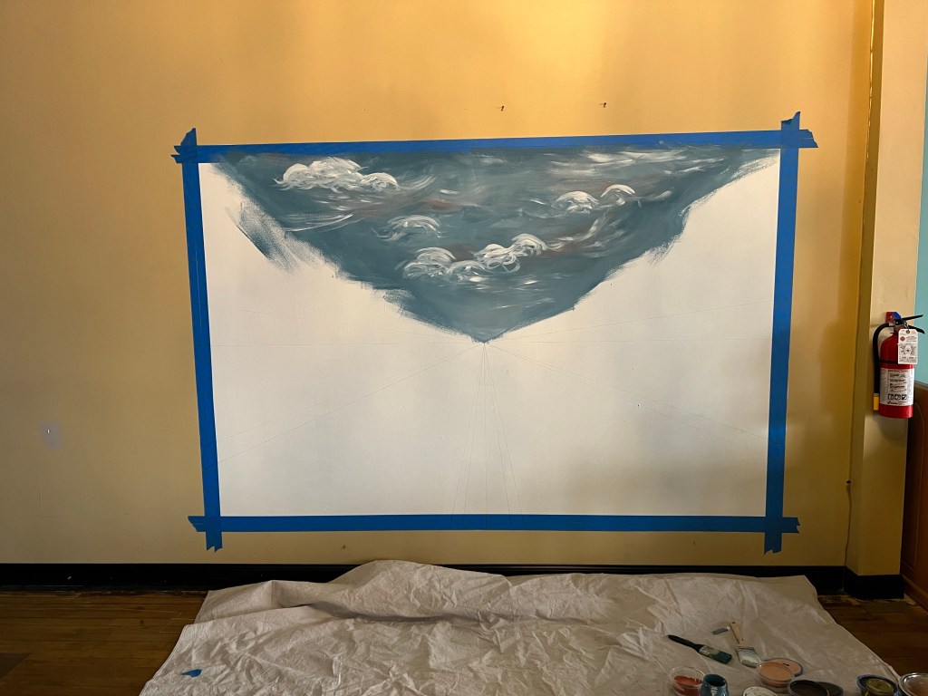
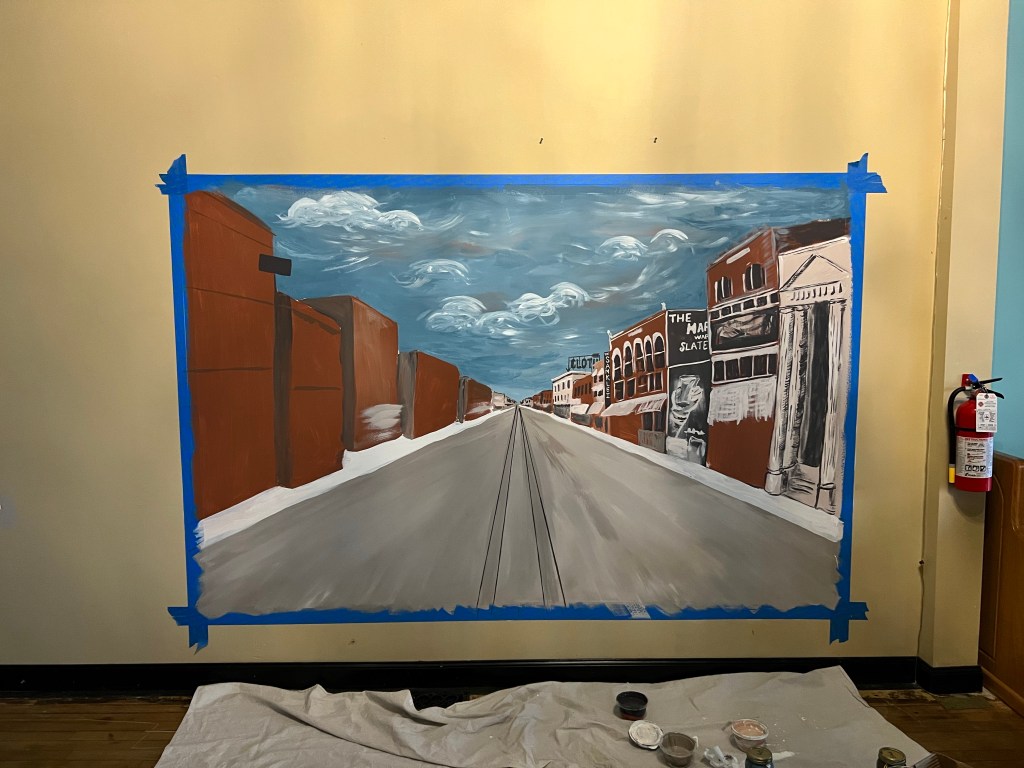
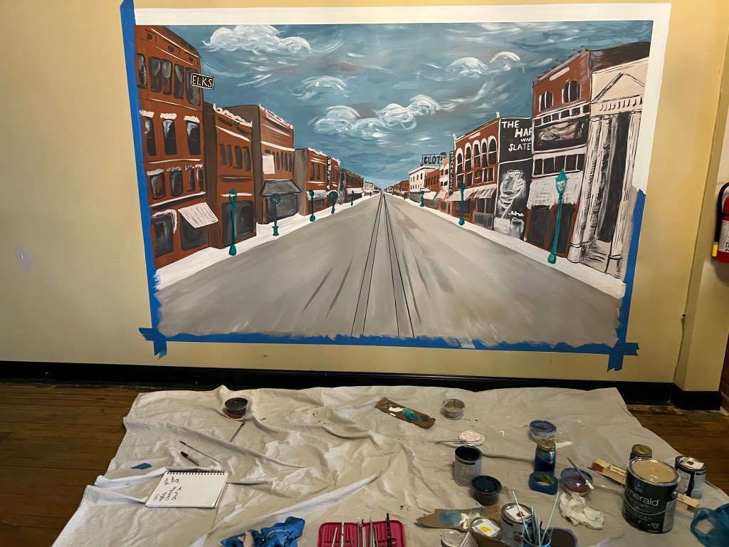
Day 2: Three days later I came in on a Monday when no one was around and painted almost the entire thing. I surprised myself! I’ll put the progress here. I started with perspective lines and light sketching, then the background, and then buildings, and then cars and details.


I did a great job of documenting the whole thing, I was quite proud of myself. I tend to be better at the “can we skip to the good part” trend online… less the “add 15 progress photos..” one.
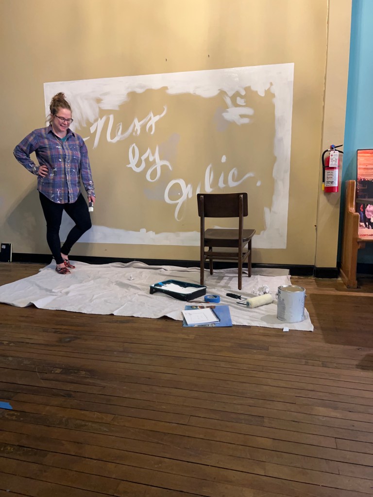
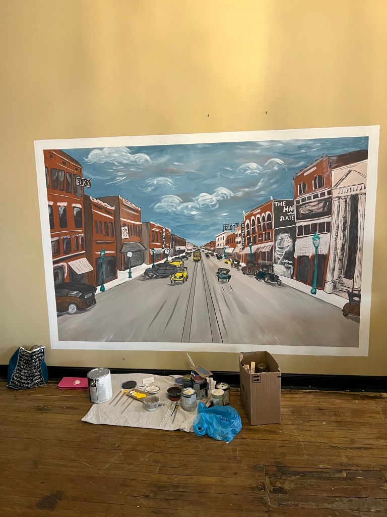
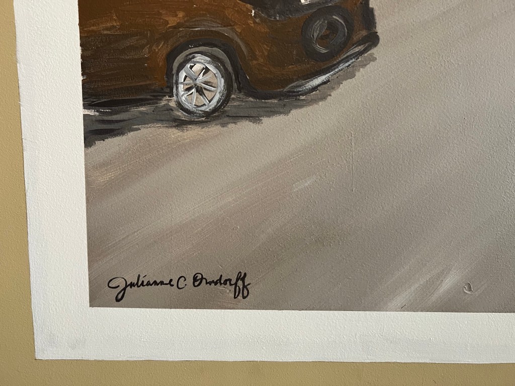
Day 3: I came back, adjusted some shadows and the cars closer to the “front” of the mural. I also added the description from the original postcard in the white boarder. And finally, a signature, for which I obviously practiced.


I love hearing about everyone’s responses when seeing it!
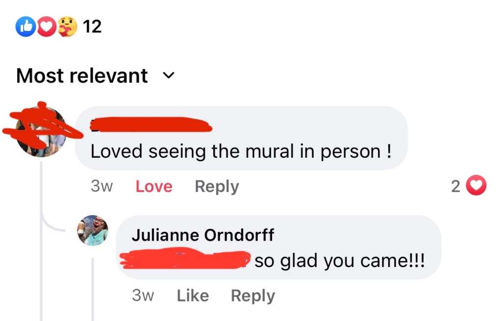
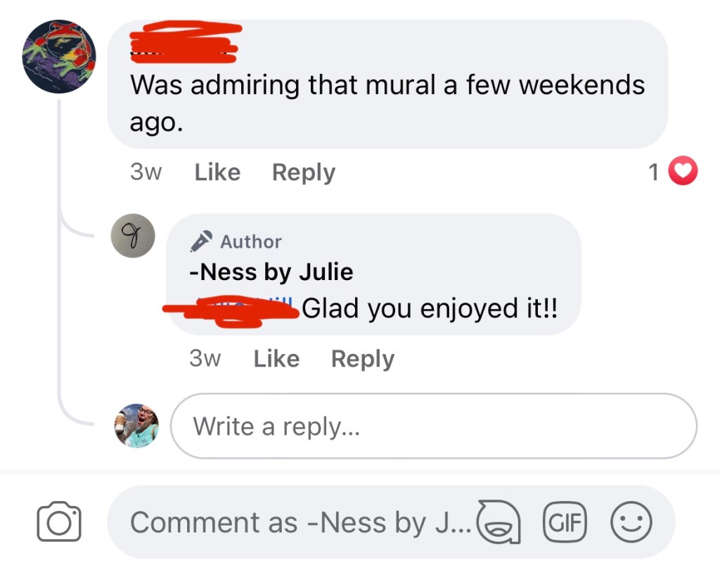
The finishing touch was really the props in front of the mural: a pile of old suitcases perfectly blocking the fire extinguisher from the “photo op spot” (totally visible from the dining room, #safetyfirst) and making it feel like the scene is coming out of the wall and you’re preparing to board a ferry out of Lorain! I love it. Go check it out and let me know what you think in the comments!
What a ride. On to the next adventure!
Love to all,
Julie
